The Story Behind the Epiphany Banners
IMPETUS
Six people at my church wanted to learn how to make banners. One person had experience making baby quilts. Another person loved fabric stores but knew little about the qualities of different fabrics. The others were curious but had no experience with sewing or other aspects about banners.
LOCATIONS & ASSIGNMENTS
We decided to make six small banners for Advent. They would fit pleasingly along the long walls on each side of our sanctuary. Each person agreed to make one of the banner fields, with the sewing person teaching the others how to use her sewing machine. I would design the elements, sew them, and the six would help attach them to the fields.
EFFICIENCY & VARIETY
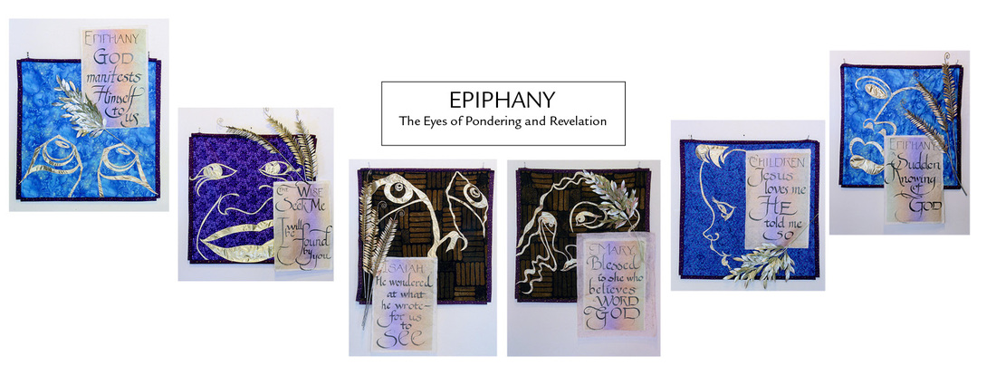
To save labor, we chose to make one side of the banners for Advent, and the other side for Epiphany. Each banner would be 40 inches square. For variety in hanging, the Advent banners hung on the diamond, with thin willow branches threaded through and extending beyond the four borders. The Epiphany banners would hang on the square. We added artificial foliage and calligraphy on rice paper to make them highly different from the very simple Advent banners.
CONCEPT & TECHNICALITIES
Advent means the approach of Christ’s Light into the world. So we wanted fabrics of dark to light colors and different prints. The prints had to be large enough to be seen from a distance, but not so large as to compete with the element on the banner. We chose to make the elements solely out of silver and gold metallic lamé. The students left the choice of elements and their design up to me.
THE ELEMENTS & DESIGN
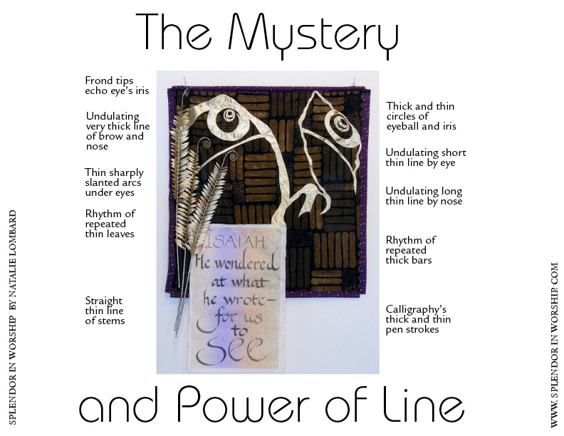
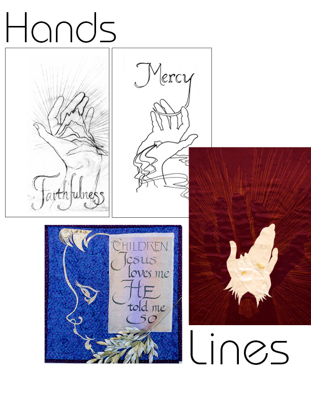
At that time in my own development as an artist, I was fascinated with line, its movements between thin and thick. Because of limited time, I needed to make the designs as simple as possible. I was increasingly aware of my own feelings when God revealed things to me, whether reading His Word, viewing a picture, or listening to a spoken word. I remembered times I despaired, times I was puzzled, and times of insight and healing. Each caused a different facial expression, a different look in my eyes. Epiphany means “a sudden knowing” or “an awareness of pure insight.” I decided the elements would be faces, minimally drawn in simple lines, with emphasis on the eyes.
SHOPPING FOR COLORS & PRINTS
Having agreed on those concepts, we visited the local quilt fabric store. What a feast for the eyes: colors galore, innumerable prints, all sturdy cotton fabric, easy fabric for beginners to handle. I showed them how to hold up a yard of fabric while the others would view the print from across the shop. If the print could still be seen at that distance, it qualified for our project. We had to remind ourselves we were not making quilts, which use a number of different prints: we limited ourselves to one print per banner, the colors moving from dark to light. One totally different fabric for the borders would unite the entire series. After many considerations and letting go of various favorites, the students chose a dark brown with a large paver-like print, a medium purple with small flowers, and a medium blue with three-inch-diameter flowers. The border fabric was a very dark purple with tiny gold specks.
INSTALLATION REINFORCES MEANING
The banners were installed in pairs, across from each other on opposite walls, the dark ones being nearest the door into the sanctuary, the brightest ones nearest the chancel altar and cross.

 RSS Feed
